Homepage
Who is...
Drawings and designs
Previous homepages
Previous homepages
If you can summarize your life in a single page,
there is something very, very wrong with your life.
Many homepage writers seem to have cracked
up under the pressure. Some people prefer not
to have one at all. I've had a few trials fail
on me, and some day what I have now will be on this page.
 The text of the first homepage I ever had has gone lost. The
only drawing in it resembled what I had on my self-made business
card at the time, a cartoon figure (that was supposed to be me)
in front of a terminal. It quickly got stolen and
copied into other people's homepages to represent them
without me knowing. I was severely flattered and
learned something about copyright protection and my ability to draw
something that resembled me, which are both fairly nonexistant.
A while later, I looked at the flimsy drawing and the chaos in the
page and decided to tackle it head-on. The
theme of scatter-gather (a kind of diagram) stood
for that; I had scattered my things all over the place, and now
readers could go gather them up.

This one didn't actually get used; instead I got started with
imagemaps. The
second design had its heroine sit
cross-legged in the middle of a room cluttered with things that,
more or less mysteriously, corresponded to pages I wanted to
offer.
I learned two things. One, it's not only me
that I can't draw to a reasonable resemblance, I can't draw almost
anything.
(The little Bonsai tree was interpreted as a ``Mushroom growing out
of a microchip,'' and the figure in the middle as a
``chinese guy looking up''). Two, imagemaps are
horrible to maintain, partly due to the imagemapping software itself,
which required you to jump through all kinds of hoops to be
able to specify where the user went and was amazingly unhelpful when
things went wrong in any way.
And then visited HotWired and felt
ashamed for
my flimsy lines. Okay, it was kind of cute, kind of
disoriented, but it didn't hit people the way that
Wired's thick, confident strokes did. I wanted those
strokes, too. And I was sick of the inability to combine
text and graphics in any reasonable way, so I decided to not do
text at all; the index would be purely graphical.
On the search for an index-like graphic, I decided on brain
segments, brain parts that would correspond to certain
functions. Based on this brain
from the history of medicine image database, I came up with the
third design.
To accomodate text-based viewers, I had to re-write the
imagemap program, and fixed a few things that had annoyed me
earlier. The brain came along nicely. Most
people who already knew me liked it, with one notable exception
who refused to enter that page because he found it repulsive.
People who didn't know me wondered
whether I was crazy or what? Nobody could
find a thing.
Slowly gaining a few things on the server that were actually
worth finding, I experimented with mixtures of text
and images;
it's really really hard. A similar design took off on
handreading - the areas in a hand would
correspond to the linked-to pages - but I didn't really have
the typographical tools and knowledge
to write such a map, and the whole thing drowned in
line puns.
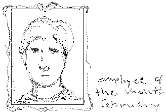
 Then I started sketching was a pseudo-commercial site
that would happen to feature its actual owner as the
``employee of the month,'' but I'm clearly not up to it,
graphically. Besides, although I haven't seen the
employee thing used yet, there are a few pseudocommercial sites
that do this schtick with an amazing devotion and textual and
graphical talent that I simply can't match, and probably shouldn't
try to.
 Recently, I discarded a homepage that was mostly textual,
with this guy all over it. The boggling brain still appears
occasionally in other contexts. I like the logo, but
the page layout had a bad real estate problem in anything except
Mosaic, and, partly because I was spending some time on artwork
for another site, I was starting to think more about color and
selling stuff than about text.
Gee, that one sure went down fast.

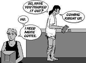
What we see here (and what nobody except me would of course recognize)
is Evelyn (a cartoon character) burning the midnight oil in front of
my old qvt119 terminal, while Sebastian (another cartoon character),
who can't sleep, has gotten up and is preparing coffee for her, an ancient
gesture of intimacy.
The thermos can is a Danish design and is, in reality, red.
Sebastian and Evelyn are trying to fix a time travel experiment that
mis-fired and, instead of the expected politician, transported a young
student into the present time, together with parts of a library; which, since
the student has lost all memory, becomes the prime means of reconstructing
their victim's identity. (At least that's what it would have
been, if I had ever gotten around to writing the story.) The page's background dimly shows the fragmenting head of the
victim, and the title ``scatterhead'' picks
up the motif of earlier pages.

``101 dull martians'' was a play on the Disney movie ``101 dalmatians'',
101 as the number of introductory classes in america, and 101 as used
in Orwell's 1984, the number of the room that contains everybody's
deepest fear. The home page that went along with it was
impossible to navigate but looked okay with lynx, looked so-so
with Mosaic, and drove me nuts with Netscape. When
I started playing with Java, it soon acquired a ``warp'' to a
Java eye-covered home page that I couldn't
use as a real home page because there was no way in hell I could
make the Netscape tables work with anything that didn't have tables.
 The text of the first homepage I ever had has gone lost. The
only drawing in it resembled what I had on my self-made business
card at the time, a cartoon figure (that was supposed to be me)
in front of a terminal. It quickly got stolen and
copied into other people's homepages to represent them
without me knowing. I was severely flattered and
learned something about copyright protection and my ability to draw
something that resembled me, which are both fairly nonexistant.

 Then I started sketching was a pseudo-commercial site
that would happen to feature its actual owner as the
``employee of the month,'' but I'm clearly not up to it,
graphically. Besides, although I haven't seen the
employee thing used yet, there are a few pseudocommercial sites
that do this schtick with an amazing devotion and textual and
graphical talent that I simply can't match, and probably shouldn't
try to.
 Recently, I discarded a homepage that was mostly textual,
with this guy all over it. The boggling brain still appears
occasionally in other contexts. I like the logo, but
the page layout had a bad real estate problem in anything except
Mosaic, and, partly because I was spending some time on artwork
for another site, I was starting to think more about color and
selling stuff than about text.

